


step 1
Run the checker on any Power BI report

step 2
Read and fix your accessibility errors and warnings
step 3
Review the Best Practices documentation to learn more
overview
"As humans, it is difficult to understand issues that do not directly impact us" (Christiano, 2018).
For this reason, data visualization creators struggle to fully understand why accessibility is a necessary step in visualization creation. As a result of this, many data visualizations and reports are created in a way that impedes the ability of people with visual, motor, and cognitive impairments to understand and use them. Accessibility must be a fundamental part of the processes within data science every step of the way, not just as an afterthought.
While creating a partial solution to help Power BI developers create reports that are more accessible may seem like a small step, it is a step that seeks to lead to the consideration of marginalized groups during the design process by default. This project aims to change mindsets by giving the correct tools and information to report creators and pave the way for creating reports and data visualizations that are more accessible.
my role
Design Lead:
-
Completed competitive analysis and user research
-
Designed wireframes from feature ideation
-
Created high fidelity prototype
-
Completed user testing and lead iteration process.
context
6 month long project for Senior Final Capstone Project sponsored by Microsoft.
Team size: 4
tools
Figma, Miro, Usertesting.com
the design process
01. the problem
“The disability is not the problem, the accessibility is the problem.” - Mohamed Jemni.
-
Data visualization creators often struggle to fully understand why accessibility is a necessary step in visualization creation when they themselves do not have those needs
-
Many of the accessibility tools available to report creators currently are difficult to use and are often run after the report is created, therefore trying to fix damage after it is already done.
-
The power imbalance between those working with, analyzing, and creating visualizations and those who are directly impacted by data has gotten increasingly worse as big data becomes a larger part of everyday life (D'Ignazio, 2020, p.23). These imbalances often occurs from a lack of understanding between those working with data and those who are directly impacted by data (or lack there of).
results
02. research
Three main methods of user research were performed to understand the problem, user behavior, needs, and motivation: interviews, literature review, and a competitive analysis of existing tools. My role focused mainly on the stakeholder interviews and a competitive analysis.
purpose
key research insights
-
simplicity is key
-
limited awareness on accessibility features in Power BI
-
limited awareness on best practices for designing for accessibility
-
lots of checkers for websites but none for visualizations
-
color contrast/text contrast is important
-
current platforms do not provide solution to accessibility error
-
people need more encouragement to design for accessibility
-
accessibility needs to be thought of throughout report creation process

interviews
We chose to interview three main audiences for our initial user research: Power BI report creators, Power BI report viewers with disabilities, and anyone else with a disability affecting their consumption of data visualizations.
"I don't usually think of accessibility first when I'm creating reports. It is really confusing and I am not aware of existing features on how to make it accessible. " - Power BI report creator
"When I am looking at graphs in particular the ones with lines are hard to read. It is much easier
to read the ones with bar graphs. Pie graphs can also be difficult if the lines are not darker in
color" - Person with visual impairment
literature review
The team analyzed 20 different online resources to understand how accessibility affected data visualizations in particular and to understand different accessibility guidelines for data visualizations. The main things we learned include:
-
simplicity of content is important
-
important to have descriptive alt text
-
tab orders are very important
-
important to include ability to access underlying data
competitive market analysis
We researched 15 different existing solutions for accessibility in technology today. Some of these included: Sisense, WAVE, IBM Equal Access Kit, and SortSite, and Tanaguru. The most important things we learned from this process were:
-
many current platforms show the accessibility error but not how to fix it
-
lots of checkers for websites, but not visualizations themselves
-
lots of education on designing for accessibility, need more encouragement to do so
-
need to standardize government rules and ethical considerations
values & ethics

ethical considerations
1. Data Privacy/Security: product shouldn't access underlying data/retain any other data about users; makes it difficult to tailor solution w/o detailed understanding of problems
2. Money: how much is Microsoft willing to spend?
03. framing the solution
purpose
to break down research insights into key user needs to make ideation process simpler and frame problem statement.
user needs
educational
users should build an awareness and learn how to design for accessibility as they use our product
intuitive/simple
should not be too complicated as many users have already complained at the report creation process for accessibility is confustion
encouraging/motivational
users should be incentivized and motivated to keep accessibility throughout the report creation process.
requirements
technology
nice-to-have features
-
chrome extension
-
check for how interactions may change report
-
check for data labels turned on
-
group tests so you can select just a group to run
deliverables
-
must have:
-
coded MVP
-
best practices document
-
documentation
-
-
nice to have:
-
report with suggestions for changes to Power BI
-
not in scope
-
coding any changes to Power BI itself (e.g. changing default settings)
design challenge
How might Power BI report creators achieve accessible reports so that differently-abled people can utilize Power BI reports to their full potential?
04. ideation
purpose
to brainstorm different features and product ideas that will provide solutions for user needs and break down ideas into tangible deliverables that fit the project scope
user personas


low fidelity wireframes: brainstorming
1. Report Creators
-
Checker will test for preset accessibility issues
-
Report creator can view errors on their report and learn how to fix
-
Report creators are provided with other resources to further improve their report
2. Report Viewers
-
Must be individuals with disabilities impacting viewing of data visualizations.
-
Can submit accessibility issue for given data visualization
-
Issues are reported to developers to raise awareness

05. iteration
To test our design to see if it was comfortable and clear for users to follow and if the experience was engaging and educational.
purpose
concepts to validate
feedback form
-
includes all fields users want
-
discoverable/intuitive
-
what issues to include
-
discoverable/intuitive
-
issue presentation is clear
-
information explanation to user is clear
accessibility checker


user testing
research questions
1. Is everything discoverable?
2. Would someone actually use this?
3. Are they able to solve the problem?
4. Do they understand the difference between errors and warnings?


key insights & improvements
-
error/issue displays unclear
-
improve clarity on what is clickable and what isn't
-
provide automated fixes
-
combine similar errors and color code them
-
highlighted area on chart is not noticeable
-
link best practices doc in error report
06. final solution
Our final deliverables consisted of a best practices document and a chrome extension accessibility checker.
Best practices document:
-
more resources on accessibility errors and how to fix them
-
other guidelines to and best practices for accessibility in data visualizations
-
common errors to keep an eye for when designing reports
Chrome extension:
-
different accessibility tests that check for common errors
-
links to guides on how to fix errors
-
provides users with warnings that could turn into errors

01. run the checker
Users are able to use the pop up from the chrome extension to run tests to check for different potential accessibility errors.

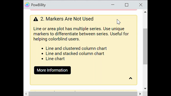
view your errors
Users can then view different accessibility errors and warnings from the display. If the area is highlighted in red, it is an error that needs to be fixed and if it is highlighted in yellow it is a warning that should be looked at more carefully.

understand your errors
Users are provided with a description for their error and how to fix it. They are also provided with a link to a resource where the user can learn more about the error and how to prevent it in the future.

learn more
Finally, users are encouraged to view our Best Practices document once they have passed the tests provided to further check their report for accessibility errors and learn more about how to design for accessibility.
reflection
This process helped me learn a lot about leadership in product design. As the design lead on my team, I led everyone in the group through each step of the design process and worked collectively to meet each deadline.
Through this experience, I learned the most important part of working in a team is communication and being able to have everyone felt heard. My team was able to get along very well and we each shared our perspectives very openly. When disagreements would arise, we learned how to effectively collaborate to come up with the best solution so everyone was satisfied with where our project was heading. I also learned that the main reason disputes arise is due to miscommunication and having organized meetings can significantly reduce the number of such disagreements.
I also learned the importance of referring back to user-centered design whenever disagreements arise because it is important that the product is effectively designed to meet the needs of the user specifically rather than the people on the design team. Empathizing with and understanding the users needs is one of, if not the most, important aspect of design thinking as in order to make truly impactful solutions it is imperative to make sure you are meeting the needs of the user specifically.